Please understand
This isn't just goodbye
This is I can't stand you
This is where the road crashed into the ocean
It rises all around me
And now we're barely breathing
A thousand faces we'll choose to ignore
Have I ever told you how much I love putting my favourite songs' lyrics into um, everything? Because I sure do. They don't have to do anything with the topic, it might as well be just one matching word in there. This time the lyrics were taken off the top of my head and the word in question was...the name of a polish.
Yep, so much for the diversity of my posts.
But shooting painted nails isn't as easy as it may seem, just like any other kind of photography. Why would anyone think it is. Why would I think it is. Which I did, judging by the folders worth of poor digital (heh, heh) snaps.
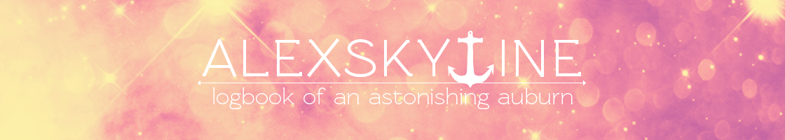
So I finally decided to try and put some proper work into it. Besides, the weather was on my side: the sky was covered in one light uniform cloud which served as a nature's softbox. I threw together a simple set-up consisting of white wove paper and my trademark desktop camera stand. You can see it
here. Then I've taken half a hundred pictures of my differently crooked fingers with various objects seized in them. Let's take a look at the best ones, shall we? :D
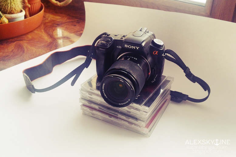
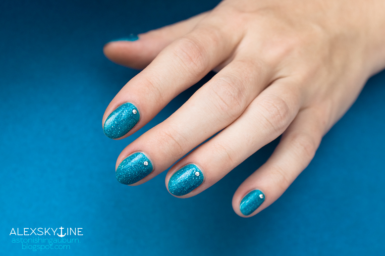
Picture Polish Ocean, along with its three other blue brothers, became one of my first indie polishes. It has a turquoise blue jelly base scattered with holographic flakes. Their holo-ness is rather timid, but they still sparkle nicely. You can wear this polish on its own or layer over, say, white or mint to tweak the hue. :)
Ocean is also prone to staining, so a good base coat is a must. I'm wearing two coats over
Kiko 3-in-1 Mat base. I chose not to put the third coat, because the slight unevenness wasn't very noticeable in person. And when it was, it reminded me of water surface glistening in the sun.
Look at this little buddy! He’s my spirit animal. While I love this picture to bits, it was probably the most challenging one to edit. The thing is, right before this impromptu shoot I've treated myself to a juicy pomegranate. As a result, my thumbnail looked like I've been digging in the nearby cactus pot. (◡‿◡✿)
My first thought was not to bother with this picture at all, but the little crabby was too good to give up. So I cued the music, unsheathe my stamp tool and plunged into the battle. Twenty minutes later, the fight was over…and I am quite proud of the result! :D
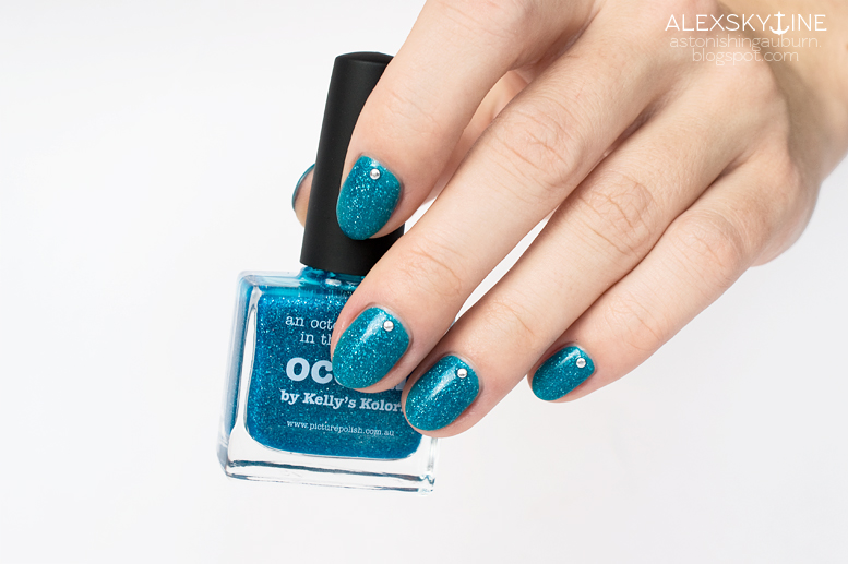
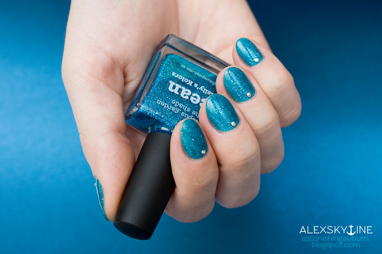
Next, I decided to play with backgrounds a little and threw in a piece of metallized card stock. Its original navy blue colour was lost in the edit, but it still looks lovely. I'm not sure my awkward hand pose does, though. So here's another bottle shot.
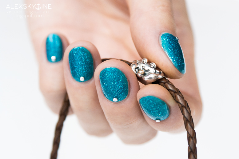
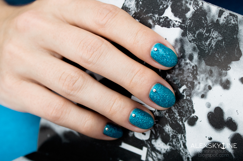
More backgrounds!
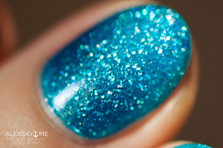
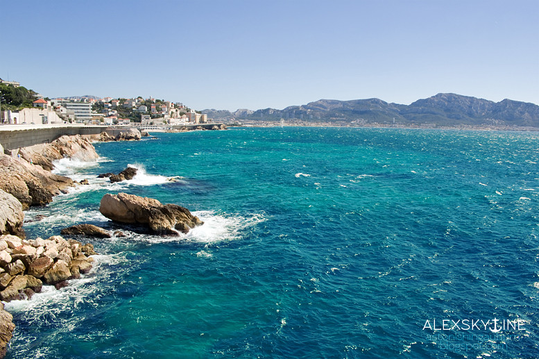
Finally, here's a macro from the previous day (hence the lack of studs), which was surprisingly sunny. I couldn't resist pairing it with a photograph I've taken on my Côte d'Azur road trip last year (according to my folder names, this is the coast of Marseille). Don’t they just look alike? :D
Phew! This post took me quite a while to write. I'm much more used to writing purely textual deviantART descriptions. There are still many little things I'm still not sure about — like whether to put text before or after the corresponding picture, or how to link pieces to each other and make a coherent story out of them...there's still a lot to learn! But it's a pleasant process, so I don't complain.
Anyway, I hope the stuff above was interesting to you! And if it wasn't (yet you've made it to the end, yay you!), let's talk music. Or travelling. Or any other stuff. :D
Cheers!


No comments:
Post a Comment